

Competitors' analysis
How ACT's visual and verbal identity compares with seven competitors, and where the open ground is.
01 · The set
Eight brands, sampled live.
Five sell certification directly to students, including ACT. Three are the enterprise and software players students end up working for. Every claim in this analysis was taken from their live homepages, September 2026. Open a brand for its full audit.
- 01 Stepful Direct DTC competitor · stepful.com Online healthcare career training, best funded of the set, “School-as-a-Service” for employers 76/100
- 02 MedCerts Direct DTC competitor · medcerts.com Largest of the set, “A Stride Company”, healthcare and IT certification 62/100
- 03 TRC Healthcare Adjacent / enterprise · trchealthcare.com Pharmacy and healthcare education and compliance, house of brands (Pharmacist's Letter, NatMed and others) 52/100
- 04 Relias Adjacent / enterprise · relias.com Healthcare workforce training and compliance platform, portfolio of six brands (Relias Academy, Nurse.com and others) 50/100
- 05 CareerStep Direct DTC competitor · careerstep.com Online healthcare training since 1992, incumbent, a division of Carrus 48/100
- 06 ACTUs Us · advclinical.org Online allied-health certification (CCMA and others), 8–12 week programmes, direct-to-consumer 38/100
- 07 HealthCareerCerts Direct DTC competitor · healthcareercerts.org Online healthcare certification, the brand our own grid calls our model-for-model mirror 30/100
- 08 Audirie Adjacent / software · audirie.com AI-powered communication simulations for clinicians (Australia) 26/100
Colour
Sampled from the live site and measured by the share of the painted page it covers, not from a published palette.
Type, icons, imagery
Counted from the homepage markup: type elements, icon files, image files and their names.
Rating
Each brand scored 0–100 on six dimensions: logotype, typography, colour, perceived quality, perceived exclusivity, approachability.
02 · Where we stand
Sixth of eight, ten points below the category mean.
A weak category, and we are in its weaker half. Below every direct competitor except the one our grid calls our mirror.
03 · Industry insights
Six things the category does by default.
-
01 Category code · the numbers race
We publish the smallest numbers in the set.
Our 97% pass rate is beaten by HealthCareerCerts' claimed 100%. Stepful publishes 27× our partner count. Every competitor also holds a #1 of some kind: Stepful “#1 Ranked EdTech company in the US by TIME”, TRC “The #1 trusted source”.
We hold a Forbes #1 in CCMA and it appears nowhere on our homepage.
For ACTDo we compete on the size of the number, or stop competing there?
- Stepful 40K+ students 27K+ clinical partners
- MedCerts 100K+ students 4.9/5 from 3.5K+ reviews
- Relias 13K customers 4.5M caregivers · 3K+ courses
- CareerStep 150+ health systems since 1992
- ACT 97% pass 1K+ partners · no student count published
- HealthCareerCerts 5K+ graduates 100% pass rate · 5.0 Google
-
02 Category code · speed
Speed is the entry ticket, not a position.
5 of 5 direct DTC competitors claim speed. And the claim is made regardless of the fact: Stepful calls itself the fastest while running 4–5 month programmes; ACT's are 8–12 weeks.
The category asserts speed by default, so speed cannot separate us from it.
For ACTIf every competitor is a faster road, does it matter how fast ours is, or where it goes?
- ACT“The Fastest Path” · 8–12 weeks
- Stepful“the fastest, most affordable”
- HealthCareerCerts“Just 4–12 Weeks” · “Job-Ready in Weeks”
- MedCerts“short-term” · “fast” · 4–28 weeks
- CareerStep“Start training for tomorrow—today”
-
03 Identification · colour
Neither of our two colours is ours.
5 of 8 brands are blue-dominant. Three have already left: CareerStep to teal, Relias to green, Stepful to warm cream. “Get out of blue” is not an untouched insight; it is a move three competitors have already made.
Our navy sits inside four others (MedCerts #1E2B64, HealthCareerCerts #494EB2, TRC #213B8C, Audirie #1E3A8A). Our accent #00BFAF sits on CareerStep's primary #00918C. We are standing on two other brands at once.
For ACTWhich of our two colours, if either, is worth defending?
Our navy, inside four others
Our accent, on CareerStep's primary
-
04 Industry insight · type
Licensed type tracks company size, not category.
3 of 8 brands run licensed type systems, and all three are ACT's largest direct competitors: MedCerts (largest of the set), Stepful (best funded), CareerStep (incumbent since 1992). Each runs a full weight range.
5 of 8 run free defaults. Among direct DTC competitors only two do: ACT and HealthCareerCerts, the brand our own grid calls our mirror. A prospective student comparing tabs reads that difference before reading a word.
For ACTIs our typography a decision, or the absence of one?
- Stepful
- MedCerts
- CareerStep
- TRC Healthcare
- Relias
- ACT
- HealthCareerCerts
- Audirie
-
05 Identification · what the logotype carries
78% of the set carries the brand name and nothing else.
Seven of nine logotypes carry no tagline, descriptor or endorsement. There are two exceptions, and we are one of them. MedCerts locks up “A Stride Company” beneath its name, borrowing the credibility of a listed parent. We spell out ADVANCED eCLINICAL TRAINING under our symbol, because the acronym does not carry on its own.
Relias Academy puts the parent inside the name and keeps the lockup clean. TRC Healthcare, the only other acronym, pairs the letters with a category word instead of expanding them, so the mark holds at any size.
For ACTShould our logotype keep explaining our name? Why or why not?
- Stepful
- Relias
- Relias Academy
- Audirie
- trc healthcare
- CareerStep
- HealthCareer Certs
- MedCerts A Stride Company
- ACT ADVANCED eCLINICAL TRAINING
-
06 Identification · construction
67% of the set carries a combination mark. Only four marks stand alone.
Stepful, Relias and Audirie are pure wordmarks with no symbol that can be separated from the name. Only four of the nine put a mark on its own anywhere: ACT, TRC Healthcare, Relias Academy and Nurse.com.
Our symbol is one of the more distinctive in the set: a teal slash and a navy dot, abstract, unborrowed, legible at 16px. The problem is the name underneath it, not the mark.
For ACTDoes our symbol carry enough of the brand to be recognisable without our name beside it? Should we consider another formula?
- ACT
The strongest isolated symbol in the set: a teal slash and a navy dot. Abstract, unborrowed, legible at small sizes. The problem is the name underneath it. It can also feel generic and doesn't connect us to medical education.
- Stepful
A typographic brand built around a typeface with personality that communicates seriousness and elegance, even without a symbol to recognise faster.
- TRC Healthcare
A five-petal pinwheel that stands alone in buttons and at the head of every sub-brand lockup. It makes seven product brands read as one family.
- Relias Academy
A green leaf that holds at any size and ties the child to the parent. Approachable, organic and dynamic.
- ACT
04 · Systems, side by side
Every palette and every tagline in one place.
-
Stepful
Warm cream / peachPrimary#FFFAF0 Secondary#FFD1B8 Accent#6BC6A9 -
MedCerts
Blue-violetPrimary#1E2B64 Secondary#465CA9 Accent#EE6624 -
TRC Healthcare
Blue-violetPrimary#213B8C Secondary#F6FAFE Accent#F5DD57 -
Relias
GreenPrimary#063028 Secondary#1C4923 Accent#D7E9BC -
CareerStep
TealPrimary#00918C Secondary#1F9D99 Accent#1B3C6F -
ACT
Blue-violetPrimary#324A8D Secondary#0B1A35 Accent#00BFAF -
HealthCareerCerts
Blue-violetPrimary#494EB2 Secondary#333C4E Accent#75DEFF -
Audirie
Blue-violetPrimary#1E3A8A Secondary#2563EB Accent#16A34A
ACT, by painted area
The brand colours are trim on a white site.
Ninety per cent of the page is white. Navy takes 8.8%, teal 0.6%. Given more than 0.6% of the page, the teal could carry the brand on its own.
- White 90%
- Navy 8.8%
- Teal 0.6%
- Deep navy 0.5%
- Grey 0.2%
Verbal identity, verbatim
- Stepful
“Step into your new healthcare career”
Tagline: “The fastest, most affordable way to get certified and hired”
- MedCerts
“Online Certification Training for Healthcare & IT Careers”
Tagline: “Short-term training… to get you into a higher paying career fast”
- TRC Healthcare
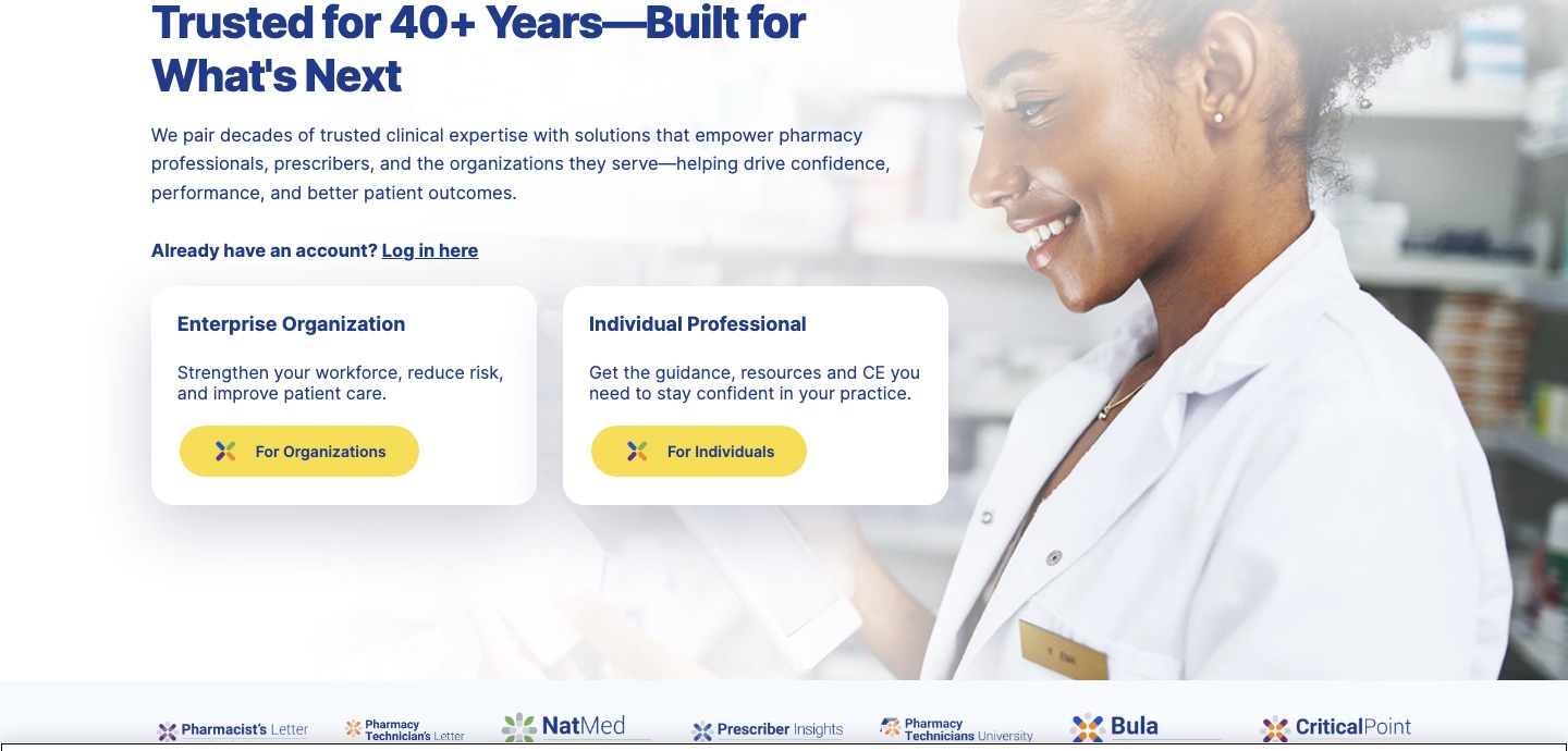
“Trusted for 40+ Years—Built for What's Next”
Tagline: “The #1 trusted source for best-in-class healthcare & pharmacy education”
- Relias
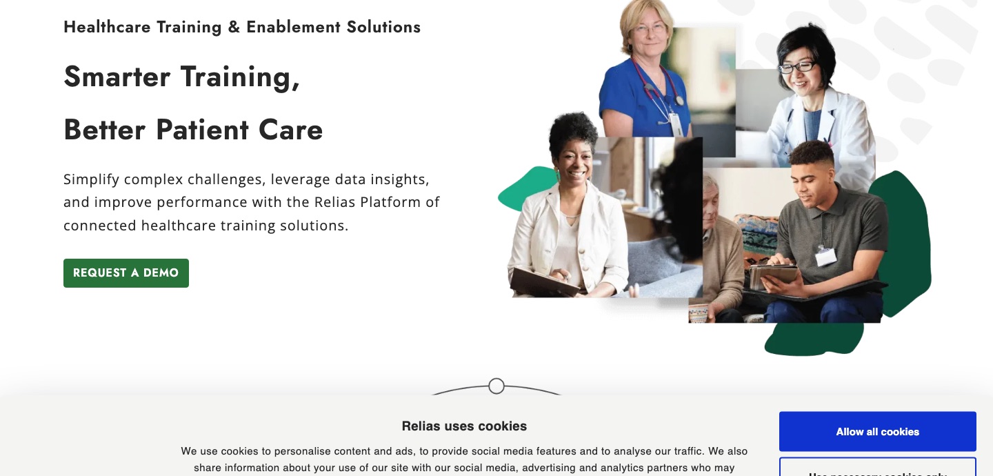
“Smarter Training, Better Patient Care”
Tagline: “Healthcare Training & Enablement Solutions”
- CareerStep
“You're on the Path to a More Rewarding Profession”
Tagline: “Online by design. Start training for tomorrow—today.”
- ACT
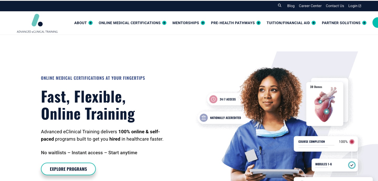
“The Fastest Path into Healthcare Starts Here.”
Tagline: “Fast, Flexible, Online Training”
- HealthCareerCerts
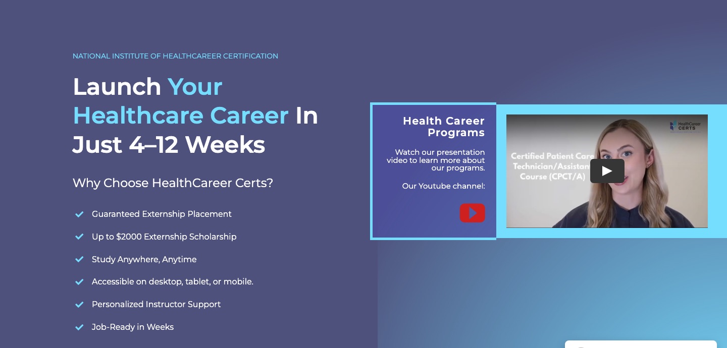
“Launch Your Healthcare Career in Just 4–12 Weeks”
Tagline: “100% Guaranteed Externship Placement”
- Audirie
“Helping Health Professionals Navigate Complex Conversations”
Tagline: “Train smarter, communicate better, care deeper.”
Marks and files
| Brand | Mark | Stands alone? | Published format |
|---|---|---|---|
| Stepful | Wordmark, serif | No | Inline SVG |
| MedCerts | Combination: emblem + wordmark + “A Stride Company” | No | Vector |
| TRC Healthcare | Combination: five-colour pinwheel + lowercase wordmark | Yes | Vector, named TRC_<Brand>_RGB_Positive |
| Relias | Wordmark, letterspaced serif, leaf for the A | No (favicon is a cropped R) | PNG only, .svg returns 404 |
| CareerStep | Combination: chevron + wordmark | No | SVG exists, homepage serves 300px PNG; white-only |
| ACT | Combination: teal slash + navy dot, descriptor “ADVANCED eCLINICAL TRAINING” | Yes (favicon, app icon) | Vector |
| HealthCareerCerts | Combination: two-tone mark + stacked wordmark | No | Raster only |
| Audirie | Wordmark, ring-and-dot “a” | No | PNG only (612×792) |
05 · Brand by brand
What we like and what we dislike.
One brand at a time, from the strongest to the weakest. Open a brand to read the element-by-element audit.

01 Direct DTC competitor
Stepful
The only brand in the set built by designers, for a design-literate audience.
SangBleu Republic + DM Sans 76Overall
01 Direct DTC competitor
Stepful
The only brand in the set built by designers, for a design-literate audience.
-
Identity
A licensed serif, a warm proprietary ground and press endorsements placed where proof belongs. It does not look like healthcare training, and that is the point.
What we like
- Vector-native. The mark ships as inline SVG and scales cleanly everywhere.
- Earned proof, displayed. Axios, Forbes, Intercom and “#1 Ranked EdTech company in the US by TIME” used as evidence, not wallpaper.
- Coherence. Type, colour, imagery and tone are recognisably one system.
What we dislike
- The mark is the weakest part of the system. A pure wordmark with nothing to put in an avatar.
- Reads consumer, not clinical. The warmth puts distance between the brand and the seriousness of clinical work.
-
Colour
Cream ground, navy ink, and a secondary range wider than anyone else's. Navy and cream carry the brand; the accents appear in single elements.
What we like
- The ground is the idea. Committing the whole surface to #FFFAF0 rather than white separates them from all eight others.
- A real secondary range: #FFA777, #FFD1B8, #FFD700 and #6BC6A9.
- #C1FF72 is reserved for pointing. One colour, one job.
What we dislike
- Low contrast risk. Peach and mint on cream need careful handling.
- Nine values and two gradients is wide for a brand this young, and the coral carrying seven icons is on no published chart.
-
Typography
SangBleu Republic for display, DM Sans for text, and a lime highlight behind the word that carries the promise. The boldest typographic decision in the category by a wide margin.
What we like
- A serif in a sans category. Eight of nine run a sans; the serif alone makes them recognisable.
- Editorial authority. Considered, adult, not a bootcamp.
- The highlight is the system's verb, always landing on the words that matter.
What we dislike
- Cost and complexity. A Swiss Typefaces licence and a two-family system is real overhead.
-
Icons
Twenty-three icons, two colours, one drawing language. Coral for plain outlines, navy for the ones on a soft peach shape. The most disciplined icon set in the category.
What we like
- One idea, twenty-three times. A single rounded outline language with open terminals.
- The shape does the branding. The icons are off-the-shelf; the peach blob behind them is not.
- Two colours and no more. We run nine across twenty-two.
What we dislike
- The coral is not on their chart. #FF7777 carries seven icons and is published nowhere.
- Ten are expanded outlines, so their weight cannot be adjusted without redrawing.
-
Photography & illustration
Two registers that do not meet. Hero and social imagery is art-directed onto brand grounds; the wider library is conventional healthcare stock, untreated.
What we like
- Colour-matched grounds where it counts, so photography and identity read as one system.
- Real people, direct gaze. Practitioners shot as individuals.
What we dislike
- Thinner than the homepage suggests. Below the hero it is stock any competitor could buy.
- Costly to extend as the programme list grows.
-
Digital comms
The same system, recoloured per audience. Cream and lime for learners, navy for employers. The serif and the highlight travel across the site, LinkedIn, Instagram and Facebook without loosening.
What we like
- One device, everywhere. Recognisable at thumbnail size.
- Two audiences, one identity. The split is deliberate, not drift.
- Social is written, not decorated. “You've been doing this job your whole life. You just haven't had the title yet.”
What we dislike
- The accent shifts without a rule. Lime on the site, coral on social, both doing the same emphasis.
Observed on site and socialHero: “Step into your new healthcare career” (lime highlight) · “Get certified and job-ready with flexible, affordable online training.” · SEE PROGRAMS · “Over 40,000+ Stepful graduates”. Social: “How to make 6 figures in healthcare without a degree?”; “A note for caregivers”; employer page “Practice-Ready Talent”.
Profilelogotype high · typography high · colour high · quality high · exclusivity mid · approachability high
MedCerts 02 Direct DTC competitor
MedCerts
Largest of the set. Licensed type, a listed parent in the lockup, and the biggest numbers after Relias.
TT Commons Pro 200–700 62Overall
02 Direct DTC competitor
MedCerts
Largest of the set. Licensed type, a listed parent in the lockup, and the biggest numbers after Relias.
-
From the cross-set tables
The deck has no individual audit slides for MedCerts; these facts come from the shared tables.
What we like
- Colour: #1E2B64 navy, #465CA9 blue, #EE6624 orange accent. Blue-violet territory; orange appears only as an accent.
- Typography: TT Commons Pro 200–700 (TypeType), licensed, full weight range.
- Proof: 100,000+ students · 4.9/5 from 3,500+ reviews. Publishes a vector logo.
What we dislike
- Identification: combination mark with emblem, wordmark and the endorsement “A Stride Company”, borrowing a listed parent's credibility.
- Speed claim: “short-term” · “fast” · 4–28 weeks. Tagline: “Short-term training… to get you into a higher paying career fast”.
03 Adjacent / enterprise
TRC Healthcare
A house of brands, not a brand.
Inter 400/700/800 52Overall
03 Adjacent / enterprise
TRC Healthcare
A house of brands, not a brand.
-
Identity
The parent is a lowercase wordmark with a five-colour pinwheel, and seven product brands sit beneath it, each carrying the same symbol and the line “a trchealthcare brand”.
What we like
- A real architecture. One endorsement line, one shared symbol, one file-naming convention. No one else in the set has an architecture at all.
- The symbol survives alone, inside CTA buttons and at the head of every sub-brand lockup.
- Weight contrast inside one word: “trc” bold against “healthcare” light.
What we dislike
- Five colours, no reason. At 25px in the navigation the mark reads as noise.
- The parent hides behind its children. The equity is accumulating in “Pharmacist's Letter”, not in TRC.
-
Colour
One navy doing everything. #213B8C is the navigation bar and the colour of 94% of all body copy. A single yellow, #F5DD57, is the only accent.
What we like
- Ink and identity are the same colour. 3,853 of 4,105 characters on the enterprise page are #213B8C. Unmistakably theirs.
- One accent, one job. Yellow on buttons and highlight bands and nowhere else.
What we dislike
- Two navies that should be one: #213B8C and #253D87 both ship.
- No middle register. Between navy and white there is only #F6FAFE, so size is the only device for hierarchy.
-
Typography
Inter, and only Inter. Four weights across 122 type elements. The differentiating characteristic is that there isn't one.
What we like
- Genuinely one family, including inside the seven sub-brand lockups.
- A real display weight: 800 at 49px for section heads and 77px for statistics.
What we dislike
- Free, and it looks it. The default sans of the web carrying a forty-year claim to clinical authority.
- Two weights doing one job: 600 and 700 at identical sizes with no rule separating them.
-
Icons
One SVG sprite, 55 symbols, loaded on every page. There is no content icon set at all: the entire vocabulary is interface chrome.
What we like
- One sprite, one source, orderly naming. Nothing is drawn twice.
- Built to inherit: 38 of the 55 symbols use currentColor.
What we dislike
- Chrome, not brand. Not one icon says anything about pharmacy, learning or compliance.
- Hard-coded strays: sixteen one-off hexes frozen inside the sprite, and two symbols misspell “currentCollor”.
-
Photography & illustration
Stock, lightly used. Small and literal (clinicians smiling, professionals shaking hands), plus a second register of flat product screens.
What we like
- Photography stays out of the way, banded and cropped wide, never behind text.
- Product is shown, not described, at real scale.
What we dislike
- Nothing is art-directed. Images chosen for what they depict, not how they look together.
- Two registers that never meet: warm stock and cold navy interface screens, with nothing between them.
-
Digital comms
“Trusted” is the whole message. It opens the homepage, heads the stat band, carries the enterprise H1 and returns four more times. Proof is numeric: 1M+, 4M, 80%, 82%, 17%, 4k+.
What we like
- Proof over adjectives. Six hard figures, each checkable.
- One voice, top to bottom. Enterprise and individual audiences get the same system.
What we dislike
- The word has stopped working. Seven uses of “trusted”, and every competitor says it too.
- Procurement language for a human reader: “audit-ready workforce management”, “reduce variability”.
Observed on site and socialHero: “Empowering Clinicians Through High-Quality Healthcare Solutions”. Social: “Medication Talk” podcast tile; “Decoding the Lipid Guidelines”; “OPIOIDS Facts…or Fears?”.
Profilelogotype high · typography low · colour mid · quality high · exclusivity low · approachability mid–low
04 Adjacent / enterprise
Relias
A serif wordmark with a leaf for the A, and no symbol designed to leave it.
Jost + Open Sans 50Overall
04 Adjacent / enterprise
Relias
A serif wordmark with a leaf for the A, and no symbol designed to leave it.
-
Identity
RELIAS is set in letterspaced all-caps serif, the only serif logotype in the set, and ships as relias-logo-2023.png, a 2954×787 raster displayed at 156×42.
What we like
- A serif in a sans category. Recognisable before the word is read.
- The leaf is doing real work: the only letterform idea in the set.
What we dislike
- Raster, in 2026. The .svg variant returns 404, so no reversed lockup appears anywhere.
- The symbol is a crop, not a design: the R lifted out of the wordmark with the CMS image cropper.
-
Architecture
Six brands, six systems. Relias, Nurse.com, Relias Academy, Wound Care Education Institute, FreeCME and Clinician.com: five symbols, five palettes, five typefaces, no shared device.
What we like
- Relias Academy is properly endorsed, carrying the parent's name and its green leaf.
- The switcher is honest. Putting the family behind Log In matches how customers arrive.
What we dislike
- No system at all. The portfolio reads as a list of acquisitions.
- Six files, six naming conventions, all raster. Nobody owns the asset library.
-
Colour
Seven greens and no ground of its own. White carries 55% of the painted page and the warm stone #F4F4F2 another 24%; everything else is green plus teals from the sub-brands.
What we like
- A warm ground, not white. #F4F4F2 under a quarter of the page keeps the site off the default.
- The dark green earns its place behind the pull quotes.
What we dislike
- Four greens with no interval: #287439, #1C4923, #063028 and #5AA01E all ship.
- Bootstrap is still showing. Links render #007BFF, the untouched framework default.
-
Typography
Jost for display, Open Sans for text. Of 122 type elements, 77 are Open Sans and 37 are Jost. Both are free.
What we like
- A clear division of labour, never broken.
- Jost has a position: a geometric with a 1920s cast, the more considered choice in this set.
What we dislike
- Two free fonts, one of them everywhere. No licensed asset in the typography at all.
- The logo's serif has no partner. The wordmark's one distinguishing feature is never picked up again.
- 900 appears five times on 19px labels and does nothing.
-
Icons
Nine icons, one weight, one colour. A thin monoline outline set, all #272727, shipped as inline SVG with Illustrator's default export style blocks.
What we like
- One drawing language. Nine icons that clearly come from one hand.
- Inline, not locked in a font, so they can be recoloured or animated.
What we dislike
- Exported, not built. .cls-1 and .st0 are auto-generated names with hard-coded colour.
- The style blocks leak into the page: five headings render .cls-1{fill:#272727;} as text.
- One weight, three sizes. At 70px the line is too thin; at 18 it closes up.
-
Photography & illustration
Two libraries and one diagram. Warm corporate stock, plus a single proprietary asset: the Relias Platform wheel, and green organic shapes masking the hero cut-outs.
What we like
- The green blob is a real device, cheap to apply, tying photography to the palette.
- The hero is composed, not placed. The best-looking thing on the site.
What we dislike
- None of it looks like healthcare. Blazers, open-plan offices and one headset.
- The wheel uses a palette they do not own: purple, magenta and blue in the only piece of proprietary illustration.
-
Digital comms
Compliance language and borrowed proof. Every solution module ends with LEARN MORE, six times, and the body copy sells risk. Proof is numeric and testimonial: five named quotes with role and employer.
What we like
- Named, attributed proof. The most credible evidence any brand in this set puts on its homepage.
- Letterspaced caps as a second level: BLOG, WEBINAR, WHO WE SERVE.
What we dislike
- Six identical calls to action, so five offers read as one.
- Written for the auditor. The register never lifts, and nothing belongs to Relias rather than the category.
Observed on site and socialHero: “Healthcare Training & Enablement Solutions — Smarter Training, Better Patient Care” · REQUEST A DEMO. Social: “700 in-house experts” stat tile; green RELIAS tote bag; “Relias named in Seramount's 100 Best Companies”.
Profilelogotype mid–high · typography mid–high · colour mid · quality high · exclusivity low–mid · approachability mid–high

05 Direct DTC competitor
CareerStep
Thirty-four years of operation and the identity has not kept pace.
Sofia Pro 300–700 48Overall
05 Direct DTC competitor
CareerStep
Thirty-four years of operation and the identity has not kept pace.
-
Identity
A licensed sans over a reversed-only logotype, and a second file marked Division-Primary shows the brand operating as a unit of Carrus rather than as itself.
What we like
- Longevity as an asset. Since 1992 is a real differentiator in a category of startups.
- The vector exists. logo.svg sits in the theme folder and ships on partner landing pages.
What we dislike
- No positive lockup. Every published version is white.
- The homepage serves a 300-pixel raster while the SVG sits unused two directories away.
- Subordinate naming: “Division-Primary-White-Color-Bug” is the filename of a brand that has become a line item.
-
Colour
Grey and white carry two thirds of the site and teal does the rest. But there is no single teal: there are five, and the body ink is black at 80% opacity.
What we like
- The teal territory is theirs to take. Nobody else in the set owns a teal.
- The gold has one job. #F6CE6A appears on ratings and nothing else.
What we dislike
- Five teals, not one: #1C827F, #1F9D99, #00918C, #138580 and #1A9C97.
- Two navies: #181F3C in the masthead, #1B3C6F in every heading.
- The ink is not a colour. rgba(0,0,0,0.8) is a browser default with an opacity on it.
-
Typography
Sofia Pro, one family, six weights, and 700 doing most of the work. Of 138 type elements, 82 are bold.
What we like
- One family, licensed. No second family to fund or police.
- A warm geometric, a reasonable fit for a brand selling a change of career.
What we dislike
- Bold is the only emphasis. When everything is emphasised nothing is.
- Six weights, one voice. Five of them would go unmissed.
-
Icons
Seven icons on the homepage, inline SVG, two colours, one weight. The tidiest part of the identity, and neither colour appears anywhere else in the palette.
What we like
- One weight, one language. Cleaner than our own twenty-two.
- Vector and inline, so they recolour and scale without a redraw.
What we dislike
- Seven is not a system. Enough for one page; nothing to extend.
- The colours are a sixth and seventh value. The drift reaches here too.
-
Photography & illustration
Conventional healthcare stock, plus three flat illustrations in a different visual language. Neither is art-directed, and the two do not meet.
What we like
- Consistent subject. Learners and practitioners in context, at work.
What we dislike
- Untreated stock that could sit on any competitor's homepage tomorrow.
- The illustrations are a second system, in a line weight and palette the photography does not share.
- Nothing ties imagery to the brand: no ground colour, no shape, no treatment.
-
Digital comms
One teal conversion block, one navy footer, and a homepage that changes register every section. The system holds at component level and loosens across the page.
What we like
- The teal block commits the whole surface to a colour.
- A clear hierarchy of action: one primary call to action per section.
What we dislike
- Every section is a different ground: grey, white, pale teal, teal, navy.
- Nothing travels. No device survives leaving the site.
Observed on site and socialHero: “Online Training Solutions: Moving Career Paths Forward” · Explore Programs. Enquiry module: “Let's Talk About Your Career Goals”. Social: holiday tiles (Yom Kippur, Veterans Day, Customer Service Week) with the chevron logo.
06 Us
ACTUs
A symbol that works and a name that will not fit.
Oswald 400/600/700 + Roboto 38Overall
06 Us
ACTUs
A symbol that works and a name that will not fit.
-
Identity
The mark is a teal slash and a navy dot: abstract, distinctive, one of only four in the set that appear on their own. Underneath it the lockup spells out ADVANCED eCLINICAL TRAINING, because the acronym does not yet carry.
What we like
- A real symbol, used alone. The slash and dot appear without the name in the favicon and the app icon.
- Two colours, one gesture. Teal against deep navy in a single diagonal. Legible at 16px and not a swoosh.
What we dislike
- The name is doing the symbol's job. Setting the words under the mark admits the initials mean nothing yet.
- Both colours are already taken. The navy sits between MedCerts, TRC, HCC and Audirie. The teal sits on top of CareerStep's primary.
-
Colour
Ninety per cent of the page is white. Navy #324A8D takes 8.8% of the painted area, teal #00BFAF 0.6%, deep navy #0B1A35 0.5%. The brand colours are trim on a white site. Body copy runs in four different darks.
What we like
- The teal is the one distinctive value. Brighter and greener than anything the enterprise brands use; given more than 0.6% of the page it could carry the brand.
- Navy reads as clinical, the expected register for the category.
What we dislike
- The palette barely appears. No ground, no field, no band of brand anywhere below the hero.
- Four darks for one job: #0B1A35, #3D3C3D, #1D345E and pure black all set body copy.
- Both values collide with competitors.
-
Typography
Oswald over Roboto, both free, across 209 type elements (130 Roboto, 79 Oswald). Every heading is condensed, capitalised or uppercase, set at 700 or 900.
What we like
- A genuine display and text split: condensed for headings, neutral for reading.
- Numbers are given weight. The stat band at 44/700 uppercase is the strongest typographic moment on the page.
What we dislike
- Two Google fonts, one of them everywhere. Nothing is owned, and the three largest competitors run licensed systems.
- H1 appears five times, four of them numbers. The levels carry no hierarchy.
- Condensed is a cost: Oswald needs 900 to read as emphatic.
-
Icons
Two sets pretending to be one. Named SVGs (Icon_Stethoscope, Icon_Checklist2…) sit alongside five raster files called image-41.png to image-45.png, used at 60×56 as if they were icons.
What we like
- The SVG half is coherent: one weight, one teal, one drawing language.
- Subjects are specific. A stethoscope, a checklist, a certificate describe the offer.
What we dislike
- Five icons have no names. CMS upload defaults, raster, cannot be recoloured.
- Three naming conventions in one folder. No asset library, only a folder.
- Sizes drift: 21, 35, 36, 38 and 60 pixels for the same rank of icon.
-
Photography & illustration
Students, stock and badges. Photographs of medical students alongside an explicit AdobeStock file and accreditor logos: AMSA Alliance, NHA, PTCB, AMCA.
What we like
- The subject is right. Students, not clinicians: the person the product is for.
- Consistent framing. Mid-shot, natural light, one or two people, plain backgrounds.
What we dislike
- No treatment at all. No colour grade, no crop rule, no brand ground behind anyone.
- Borrowed credibility above the fold: four accreditor badges and no outcome proof of our own.
- Unmanaged filenames: AdobeStock_606491778, Airforce_Cool_Mask.png, Female-Nursing-Student-Stuyding.jpg.
-
Digital comms
The page opens with a discount. “This week only get $300 Off” sits above the headline in the same Oswald 32/700 as every section head. Then: “Fast, Flexible, Online Training”, “The Fastest Path into Healthcare Starts Here”, and a stat band.
What we like
- Plain, concrete promises. Speed, flexibility, a pass rate. The clearest offer in the set.
- Numbers carry the argument: four specific, checkable figures.
What we dislike
- Price leads the brand. A discount banner above the masthead trains the reader to wait for the next one.
- Speed is the only story. Nothing says what happens after the certificate, which is what the student is buying.
Observed on site and socialHero: ONLINE MEDICAL CERTIFICATIONS AT YOUR FINGERTIPS · “Fast, Flexible, Online Training” · “No waitlists – Instant access – Start anytime” · EXPLORE PROGRAMS. Social: “GET $300 OFF OUR ONLINE CCMA PROGRAM — THIS WEEK ONLY!”; a “Dr. Chen” doodle portrait; “PREMED CLINICAL EXPERIENCE — BACK TO SCHOOL TO-DO LIST”.
Profilelogotype mid · typography low–mid · colour low · quality low–mid · exclusivity low · approachability mid
07 Direct DTC competitor
HealthCareerCerts
The brand our own grid calls our model-for-model mirror. Free type, raster logo, blue-violet like us.
Montserrat 400–700 + Arial 30Overall
07 Direct DTC competitor
HealthCareerCerts
The brand our own grid calls our model-for-model mirror. Free type, raster logo, blue-violet like us.
-
From the cross-set tables
The deck has no individual audit slides for HealthCareerCerts; these facts come from the shared tables.
What we like
- Proof: 5,000+ graduates · 100% pass rate · 5.0 Google.
- Tagline: “100% Guaranteed Externship Placement”; hero “Launch Your Healthcare Career in Just 4–12 Weeks”.
What we dislike
- Colour: #494EB2 violet-blue, #333C4E slate, #75DEFF light blue. Blue-violet territory.
- Typography: Montserrat 400–700 + Arial (Google Fonts), free.
- Identification: two-tone mark with stacked “HealthCareer CERTS” wordmark. Publishes no vector anywhere.
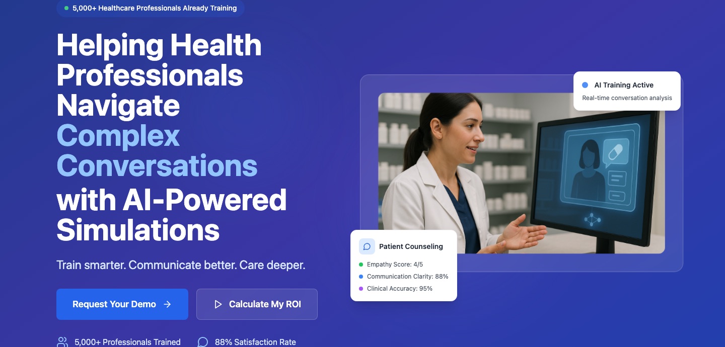
08 Adjacent / software
Audirie
The wordmark reads udirie. The first thing the identity gets wrong is the name.
Inter 26Overall
08 Adjacent / software
Audirie
The wordmark reads udirie. The first thing the identity gets wrong is the name.
-
Identity
The lowercase a is drawn as a closed ring with a detached dot and no stem or shoulder, so at masthead size the letter resolves as an o, a bullet or a loading spinner.
What we like
- One idea, not two. The mark is built out of a letterform rather than bolting a symbol beside the name.
- Quiet next to its category. No gradient, no swoosh, no abstract node cluster.
What we dislike
- It reads udirie. The name loses its first sound at every size it appears in.
- Raster only: audirie-logo-large.png at 612×792, no vector anywhere.
- Nothing to inherit the idea. On its own the ring is a circle with a dot.
-
Colour
The palette is Tailwind's, untouched. Blue-900 #1E3A8A is the hero ground; the accents are blue-500, green-500 and purple-500, three stock values at the identical ramp step.
What we like
- A real dark ground. Nobody else commits a full screen to one dark value.
- Blue is the right category signal: clinical software rather than a school.
What we dislike
- The framework picked the palette. A competitor could reproduce the scheme from a config file they already have.
- Three accents at the same weight, used for status dots. A chart legend, not a brand.
-
Typography
Inter and nothing else, across 214 type elements. Weights 400–700, the default stack a Tailwind project ships with.
What we like
- A confident display size: 60px H1 with a two-colour break that does real work.
- An even scale: 60 / 48 / 36 / 30 / 24 / 20 / 16 / 14.
What we dislike
- The default of the default. Nothing was specified.
- No voice at any size. Cover the logo and the page could belong to any AI startup of the last three years.
-
Icons
Sixty-seven inline SVGs, every one at stroke-width 2, not one drawn for Audirie. Forty-eight from a 24×24 outline library, twenty-five from Google's Material Symbols.
What we like
- Consistent weight across all sixty-seven.
- Used at the right scale, inside interface chrome.
What we dislike
- Two libraries drawn to different grids. Side by side, the corners and counters disagree.
- Nothing is theirs. The icon layer carries no brand signal at all.
- Six sizes, one stroke.
-
Photography & illustration
One photograph and a set of avatars. The hero is a pharmacist at a screen with a synthetic interface composited over it.
What we like
- The hero shows the product. It explains what the thing does in one frame.
- Named faces rather than anonymous stock.
What we dislike
- One image is the whole library. Nothing to be consistent about yet.
- Partner logos in four formats: .gif, .svg, .jpg and .png in one row.
-
Digital comms
AI is the message. The word appears 55 times on the homepage, against 6 for “conversation”, 4 for “empathy” and 2 for “confidence”.
What we like
- Attributable proof: 5,000+ professionals trained, 88% satisfaction, named Australian partners.
- One clear promise: “Train smarter. Communicate better. Care deeper.” The best line on the site, and it never appears again.
What we dislike
- The technology is the headline, not the outcome.
- Borrowed interface as evidence: Empathy Score 4/5 floating on glass cards. It looks like proof and is not.
Observed on site and socialHero: “Helping Health Professionals Navigate Complex Conversations with AI-Powered Simulations” · Request Your Demo / Calculate My ROI. Products: Audirie Practice, Audirie Certify.
Profilelogotype low · typography mid · colour low–mid · quality mid · exclusivity low · approachability mid
06 · Colour territories
The wheel is claimed unevenly, and our two values sit on the most contested ground.
Measured by painted area across nine sites. “Get out of blue” is not an insight: three competitors already left, and the three territories they took are now occupied.
-
Step 1 · The category on one wheel
Nine marks, one crowded arc.
Every brand's primary colour, sampled from the live site and placed by hue. Five of the nine sit in blue-violet, including our navy. Our teal accent sits at the bottom of the wheel, next to CareerStep's primary.
-
Step 2 · Occupied territories
Four territories are already taken.
-
Blue-violet Crowded
ACT, MedCerts, HealthCareerCerts, TRC Healthcare, Audirie
-
Teal Taken
CareerStep, whose primary #00918C sits directly under our accent #00BFAF
-
Green Taken
Relias and Relias Academy
-
Warm cream and peach Taken
Stepful alone
-
-
Step 3 · Open ground
Two arcs nobody has claimed, and one only an enterprise brand holds.
-
Orange Open as primary
Empty as a primary; appears only as an accent, for MedCerts and Stepful
-
Red, magenta, pink Empty
Nobody
Green is Relias territory, but Relias sells to employers, not students, so among the direct competitors it is open. Each option carries a risk: red to magenta reads as less clinical, orange is already an accent for two competitors, and green sits next to the incumbent's teal.
-
Area of opportunity
Corporate professionalism meets human warmth.
This presents us with a unique and significant opportunity. By crafting a narrative-driven visual identity, we can differentiate ourselves from competitors while simultaneously fostering a stronger connection with our audience.
We envision creating a visual universe where corporate professionalism meets human warmth: an identity that not only reflects our values, ideas and vision but also invites engagement, trust and relatability.
This approach allows us to bridge the gap between corporate seriousness and human accessibility, positioning ourselves as leaders who understand and prioritise the needs of our people.